A 404 page design that directs users back to a website.
A grocery store web development team needed help designing a user-friendly 404 page.
Utilized UX 404 page practices to create an engaging design that offers users the ability to be redirected to the homepage, through the use of a call-to-action button, or to click on links that'll take them to other pages on the website.
I started off my research by learning about 404 pages. This helped me understand what best UX practices I needed to incorporate in my design. From my research I determined that the best UX practices were to:
Because this was an open ended design prompt, I decided to create a few assumptions. The first assumption I made was that the grocery store has a deli section (yes, it's because I love sandwiches). Secondly, I made the assumption that this grocery store is affordable and offers weekly deals that their customers want to know more about. The last assumption I made was that the grocery store is a family owned business.
For this design I decided to incorporate three colors:
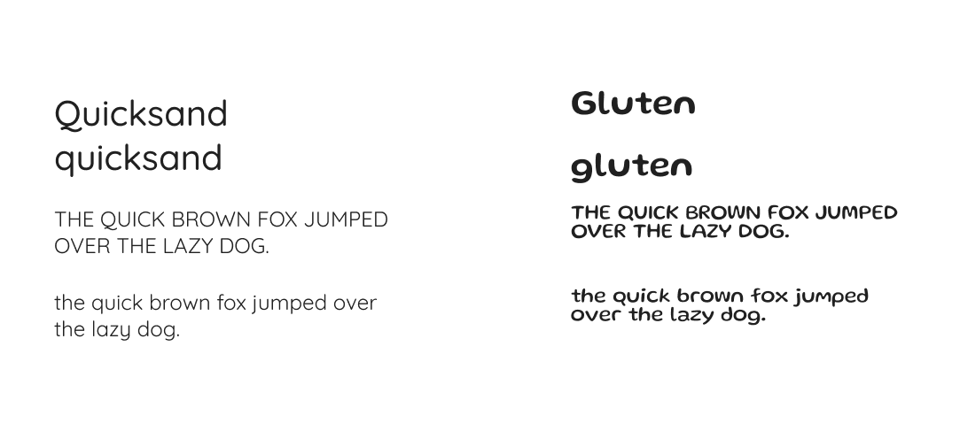
Originally, I wanted to incorporate two fonts in my design which were Quicksand and Gluten. I decided to use Quicksand because it's a san-serif which increases the readability of text. I also chose Quicksand because of its rounded edges which gives the font a modern and somewhat playful appearance. I selected Gluten because of its cartoonish feel. Although I originally wanted to use two fonts, I decided to only use Quicksand in the final
404 page design.
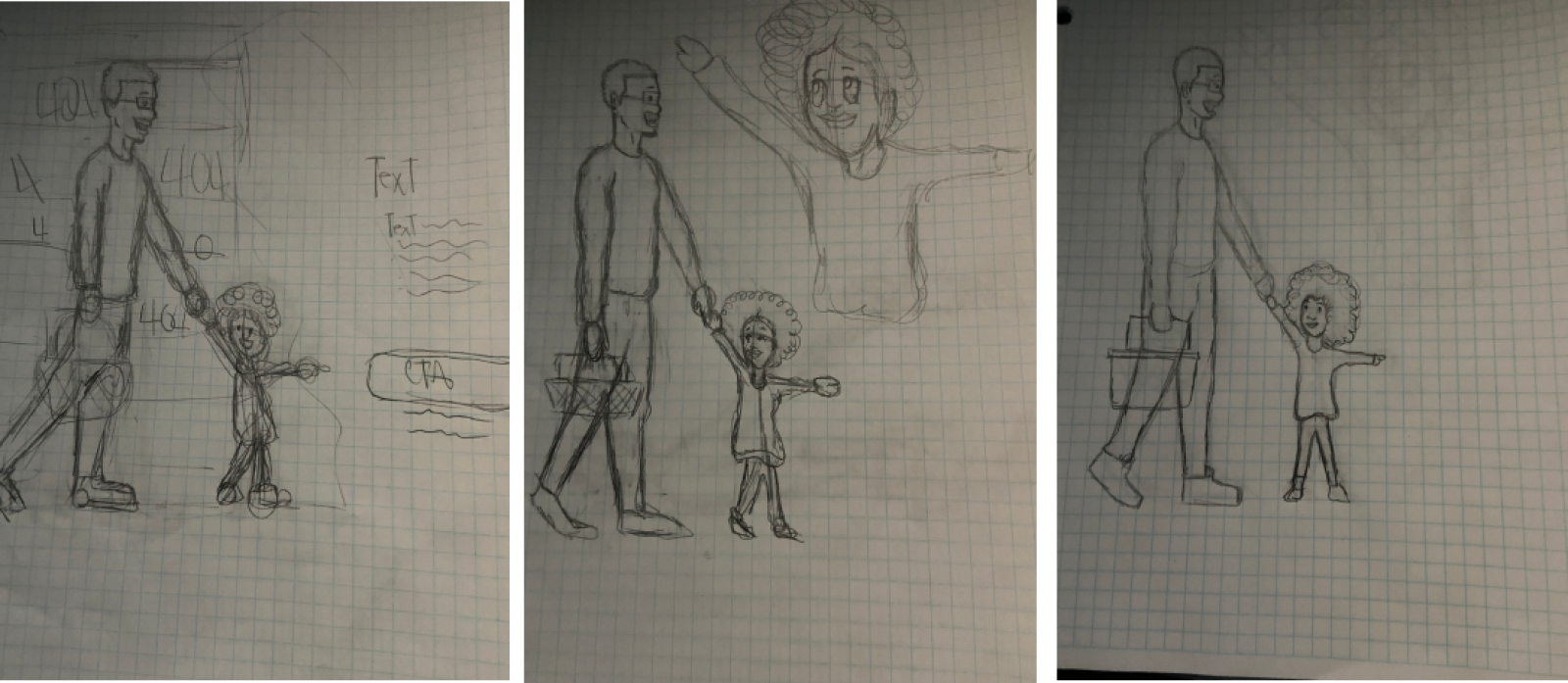
I started off sketching how I envisioned the 404 page to look. My initial concept was to design a page that shows a father and daughter shopping. The daughter would be pointing at the call to action button to direct users to return to the homepage.
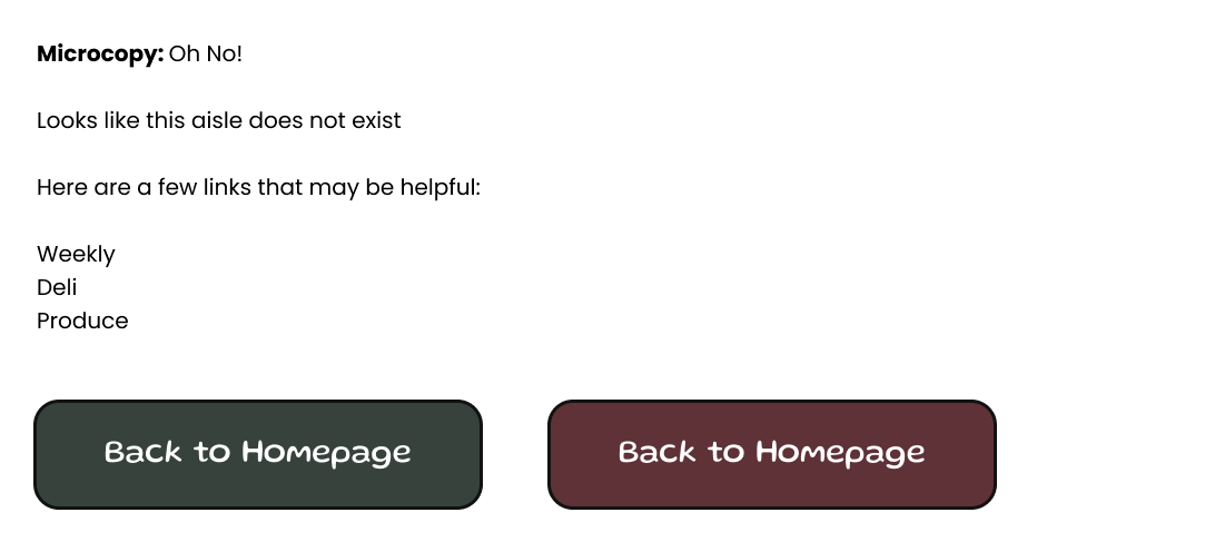
After sketching how I wanted the vector drawing to look, I started working on the microcopy. I wanted to make a straight to the point light hearted copy. I Also started to ideate what color to use for the call to action button.
This is the first iteration of my 404 page concept.
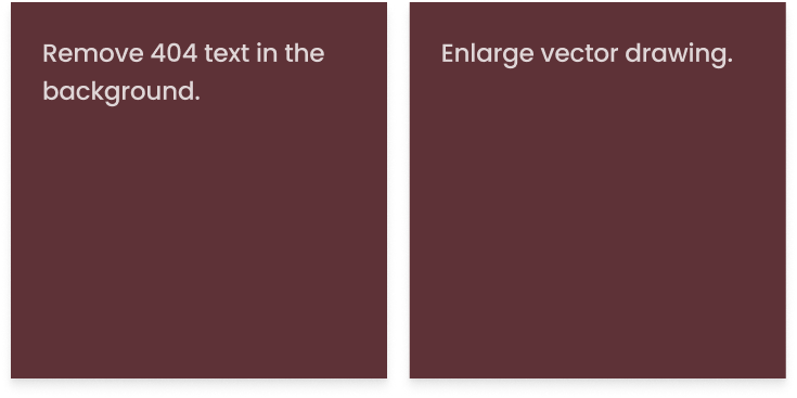
The feedback I received after the first iteration was that I should remove the shelf vector because it caused too much visual noise. I also had suggestions to change the call-to-action button to the catawba color and only use one font.
This is the second iteration of my design.