Overview

|  Summary

Redesigning a General Mills' product page utilizing Wurman's LATCH.

|  Project Scope
|  Problem

The General Mills' cereal product page is difficult to navigate due to lack of organization and hierarchy.

|  Solution

Created a playful and modern redesign that allows users to find popular cereal brands, sort by categories, find nearby stores, and learn about the company's history all on one webpage.
Research

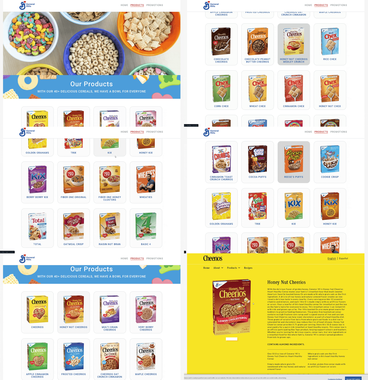
|  Original General Mills Page

To begin our research we looked at the original General Mills cereal product page.

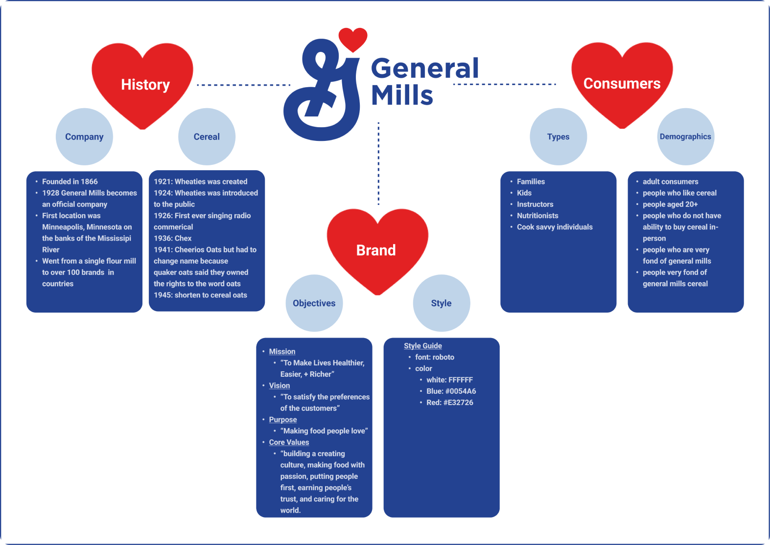
|  Mind Map

After analyzing the original page we began to research more about General Mills. We wanted to learn about their style guide, mission statement, demographics, history etc.

|  Persona

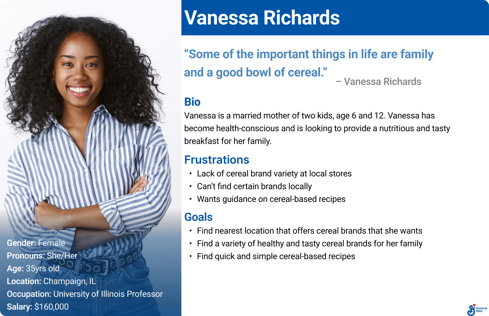
From our research we created a proto-persona named Vanessa to help us empathize more with General Mills' customers.

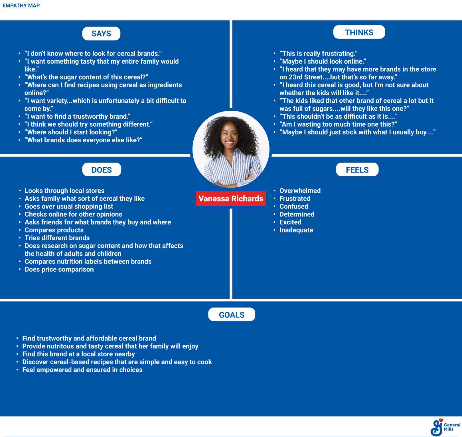
|  Empathy Map (Without Pains/Gains)

4

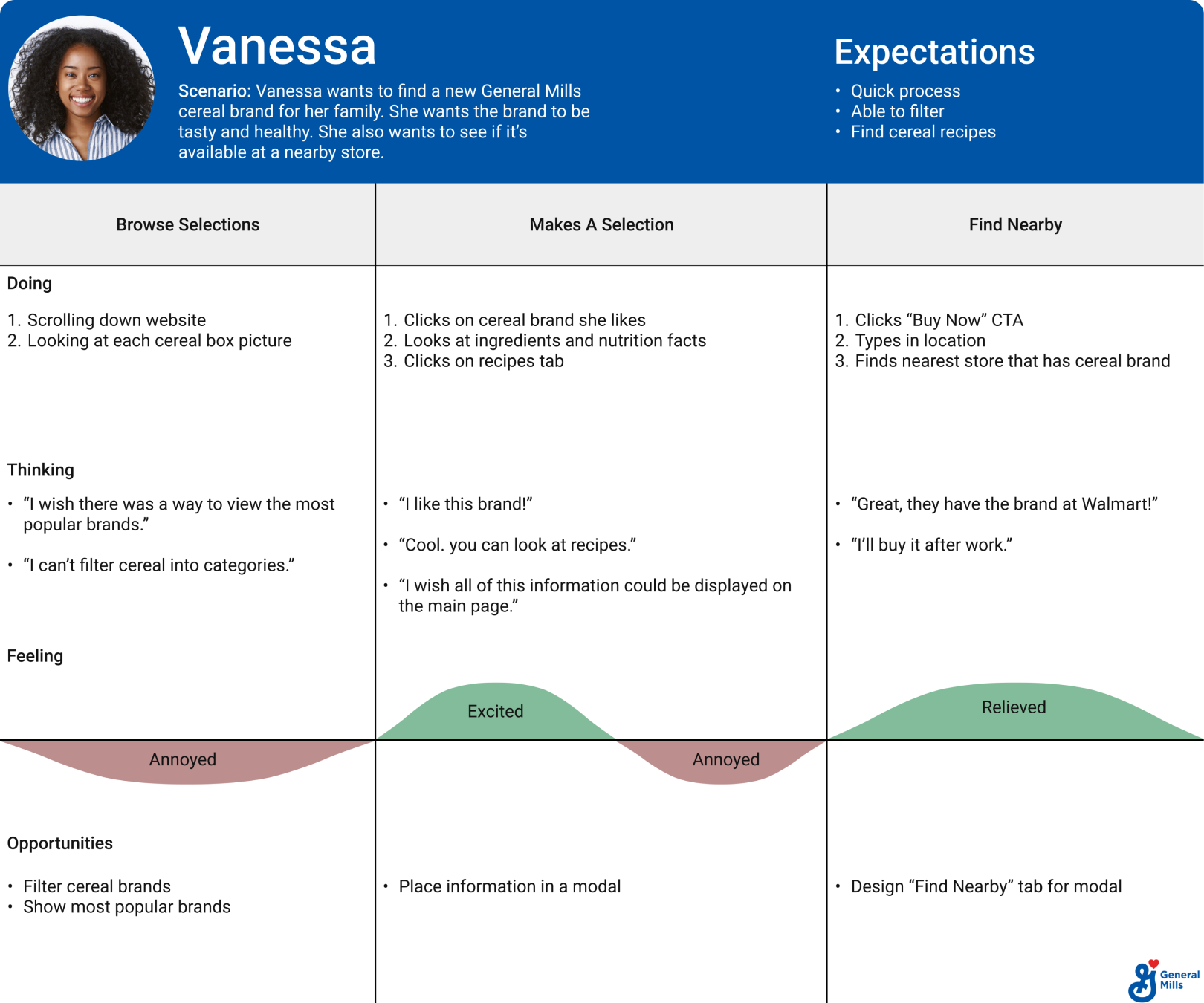
|  Journey Map

4

Design

|  LATCH Interventions

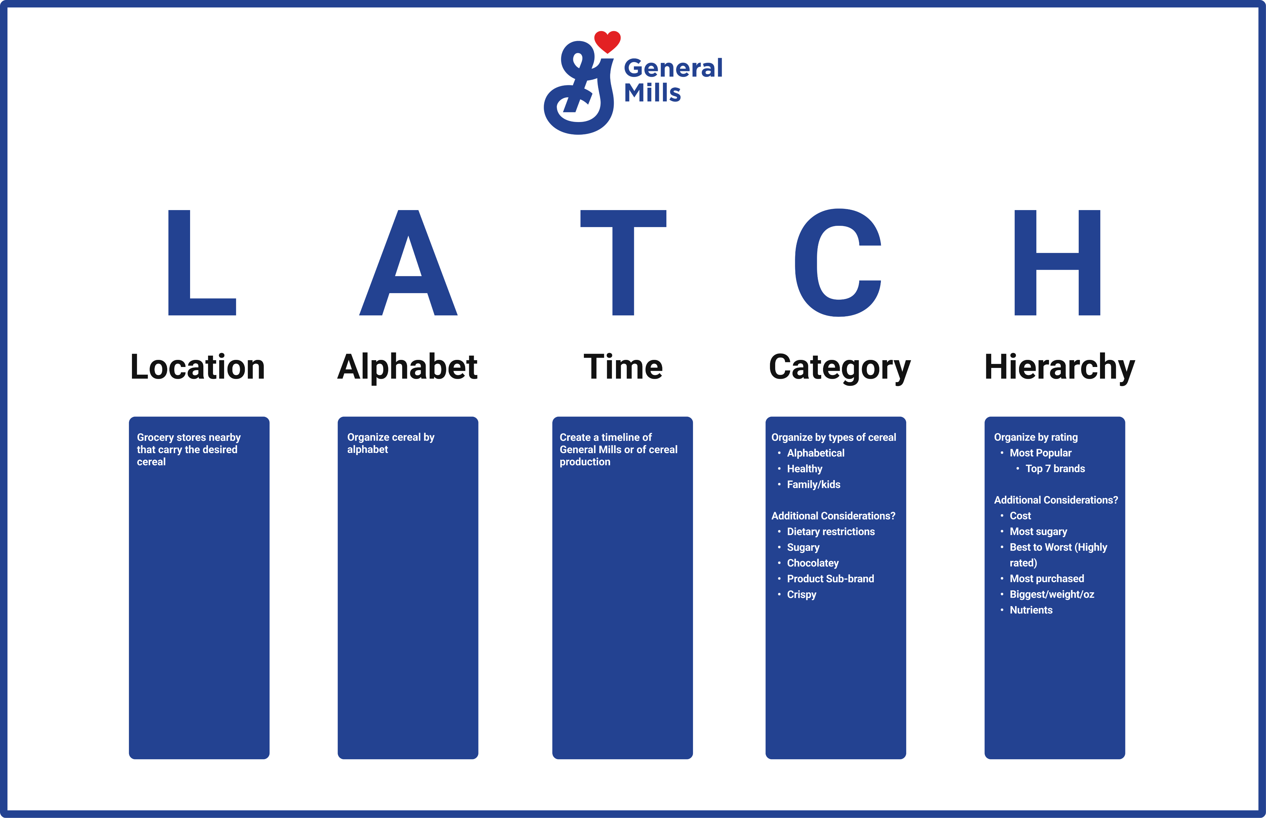
We began brainstorming possible LATCH solutions that would allow our redesign to enhance the user's experience. After multiple discussions we decided that:

  • Location will offers users the ability to find the nearest store that sells the cereal brands they want to buy.
  • Cereal will be alphabetize to help users find products quickly.
  • We will create a timeline that discusses key moments in General Mills' history.
  • Offering users the ability to sort by healthy brands, and brands for kids would be an ideal feature to incorporate.
  • We will display the 7 most popular brands on the webpage.
  • |  Ideation

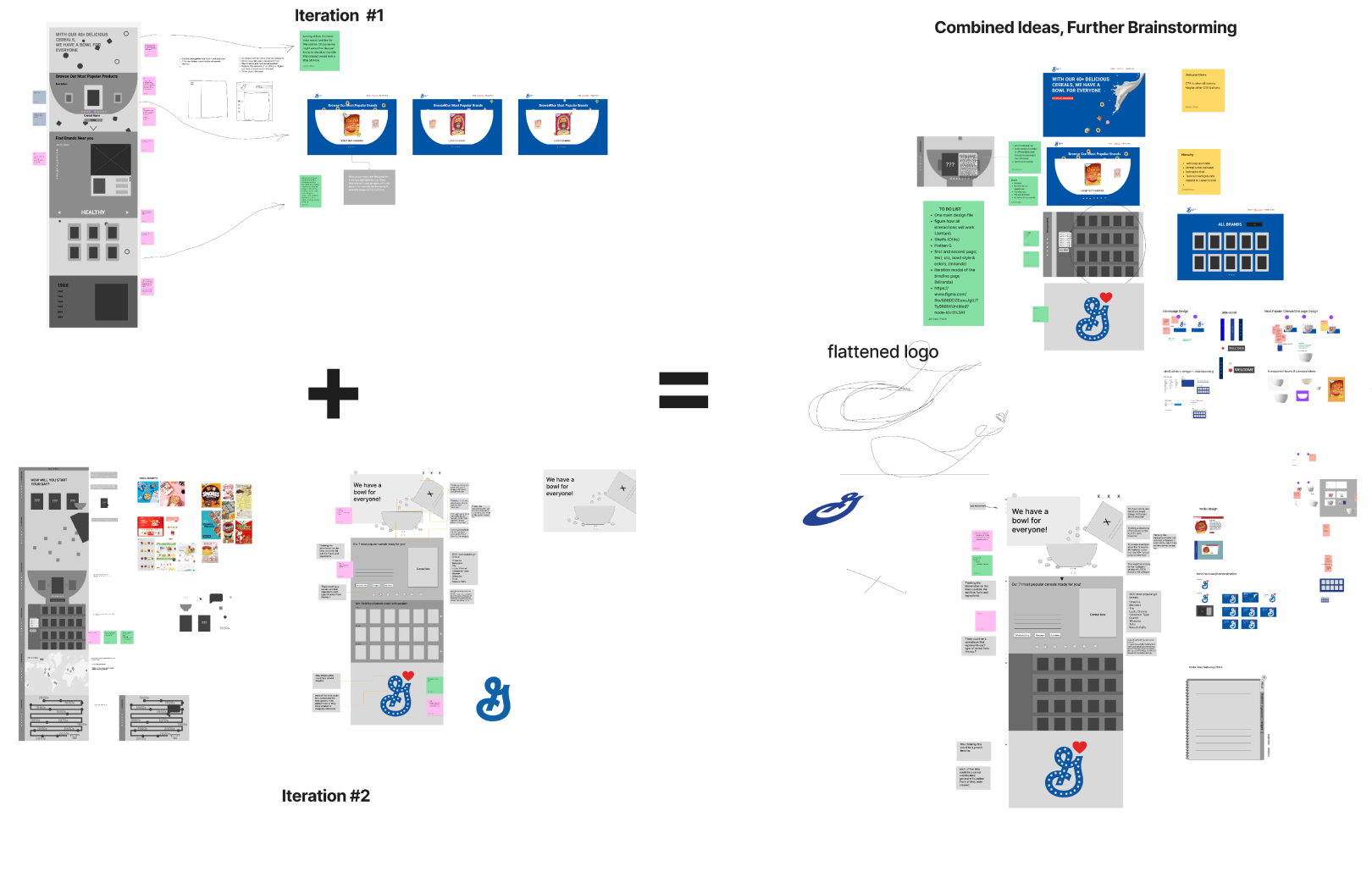
    We went through several rounds of design iterations. Our approach was to "frankenstein" all our ideas until we found a design we wanted to move forward with.

    quicksand-font

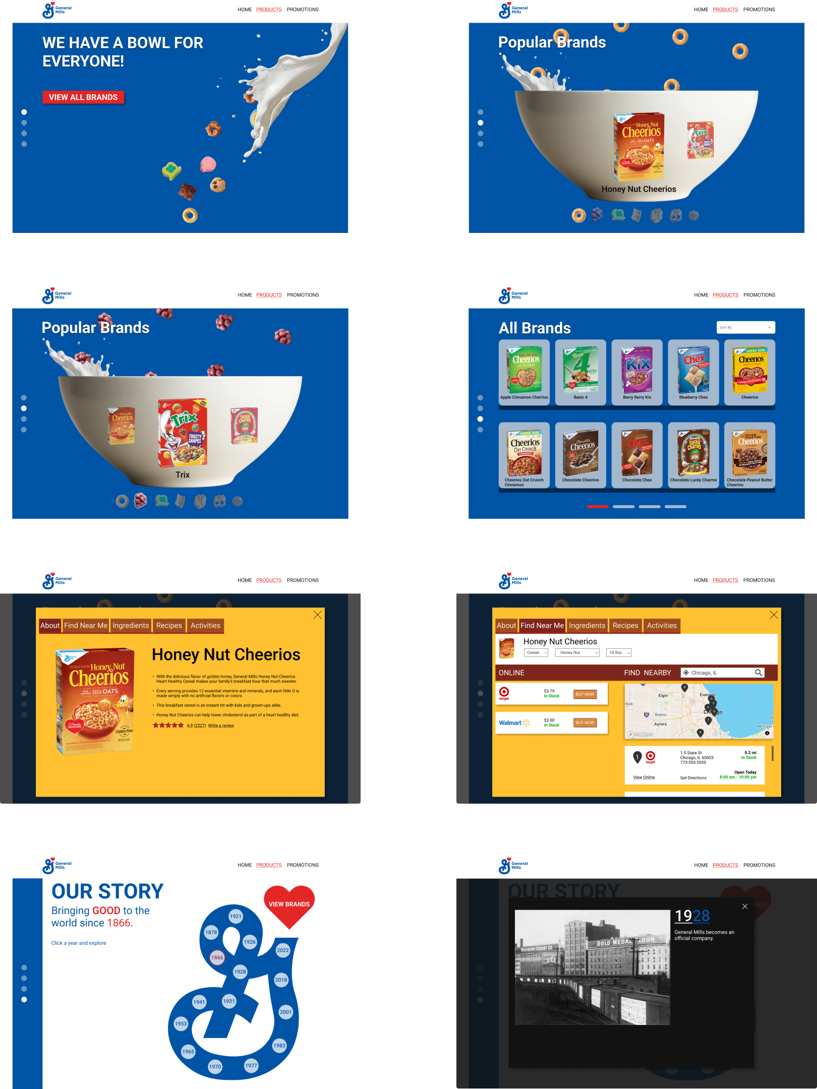
    |  High Fidelity #1 Screens

    Concept 1 process

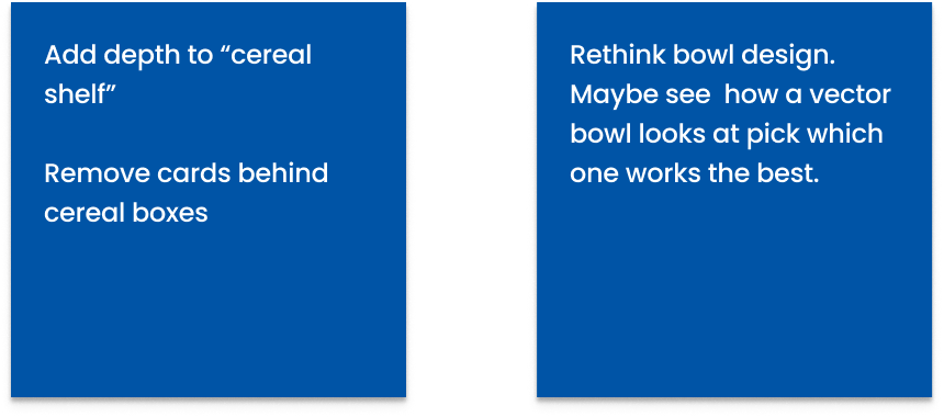
    |  Iteration #1 Feedback

    Concept 1 feedback

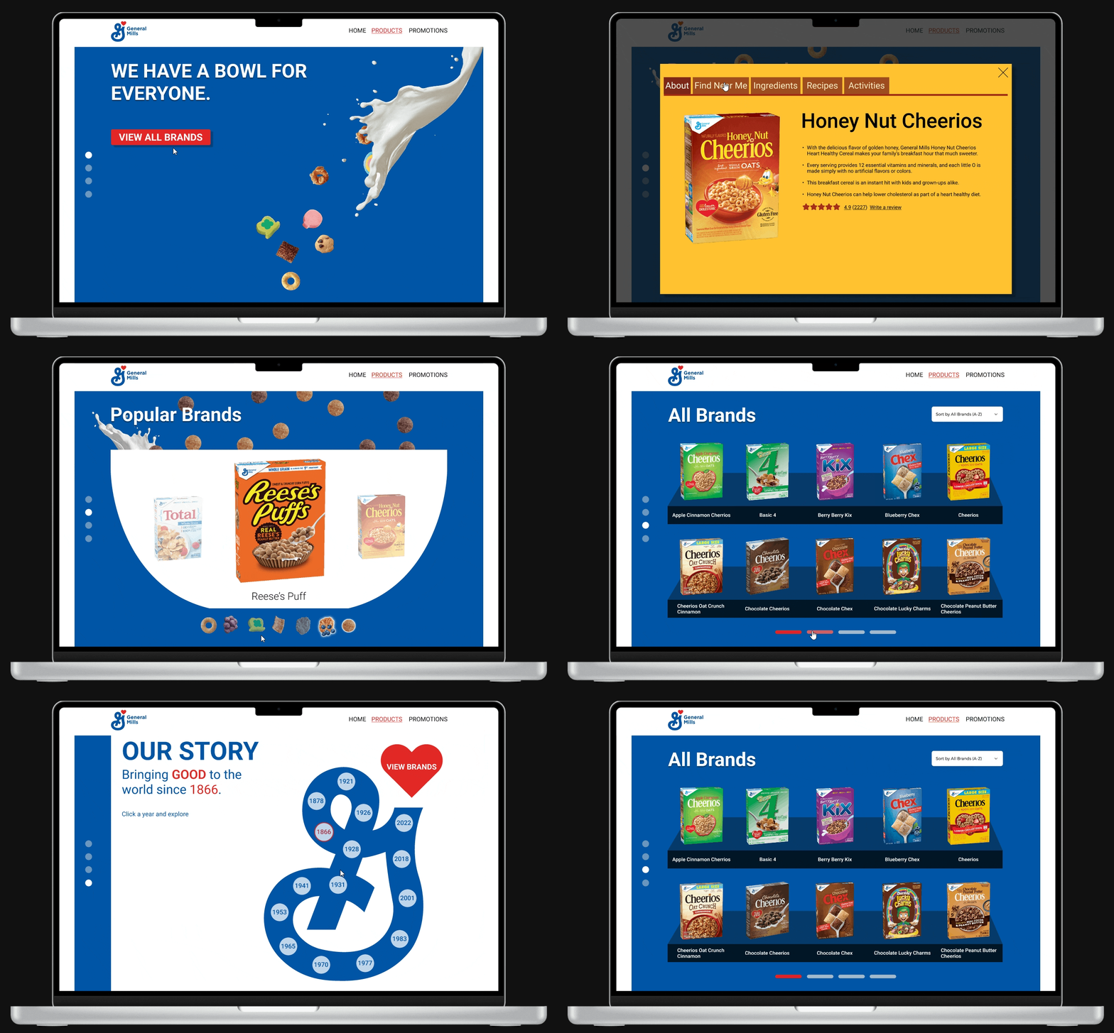
    |  Final Design

    Concept 1 process
    Top