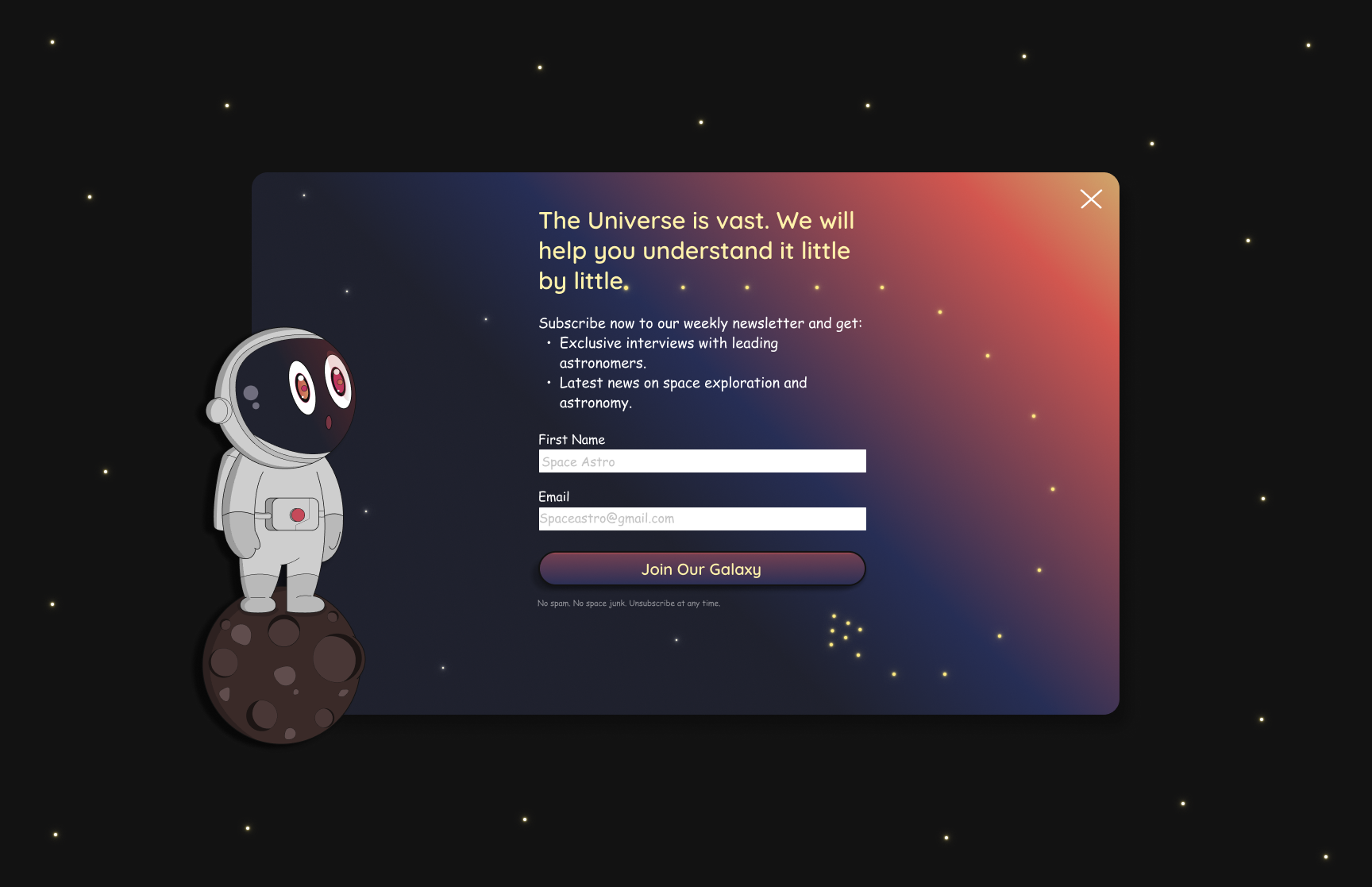
A Modal design that utilizes microcopy and Gestalt Principles to encourage users to sign up for a newsletter.
Create a newsletter call-to-action that utilizes great microcopy to encourage users to sign up.
Designed a captivating modal pop-up that directs the user's attention to important text and a call-to-action button.
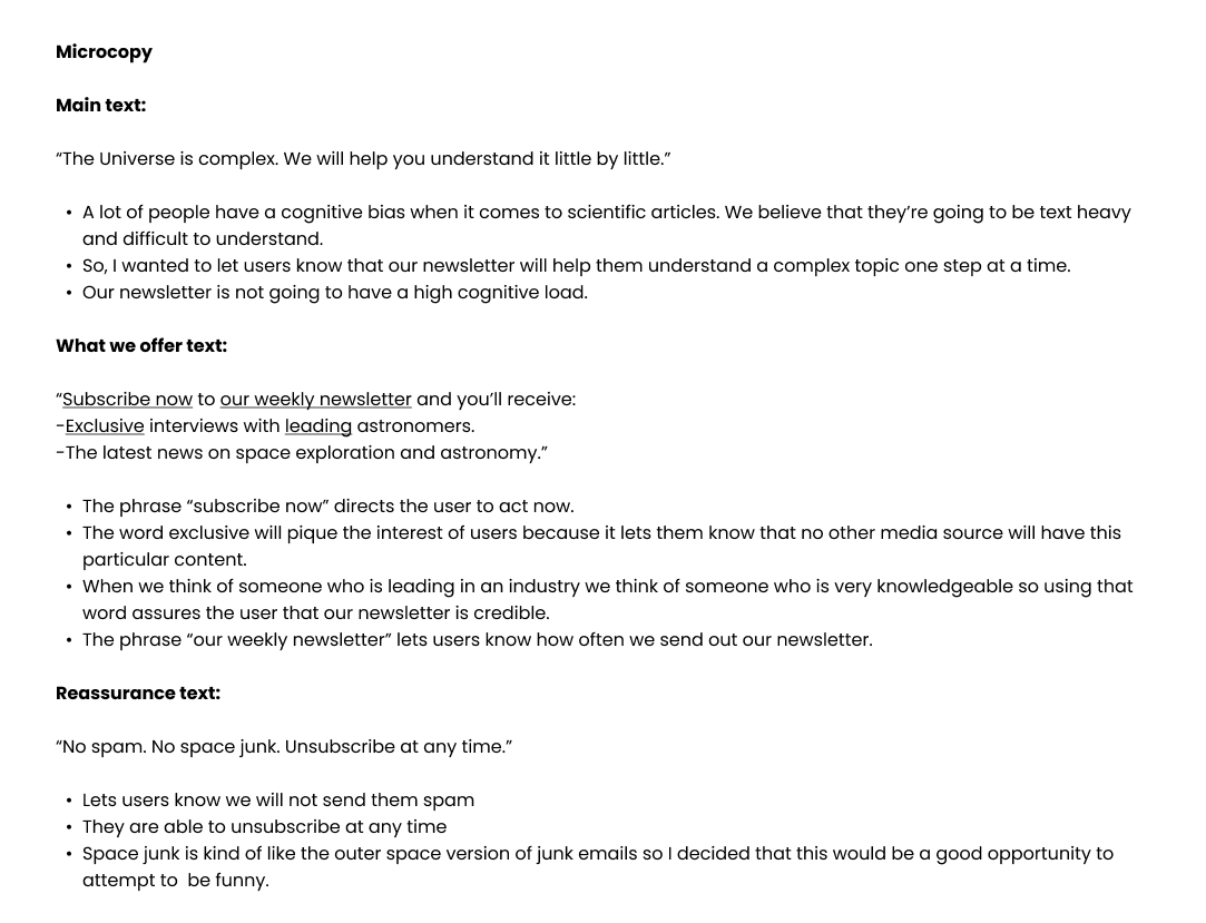
Since the challenge of this design was to primarily focus on the writing, I decided to research more about microcopy. The key takeaways that helped me in this particular design were to:
I decided to make an assumption since this was an open ended design prompt. I assumed that the modal pop-up design would be for an astronomy news website that provides easy to understand content regarding the Universe. This assumption would help guide my design decision.
I decided to use three colors for my modal design. I selected blue because it symbolizes trust and reliability. Aside from this, blue was a great color to symbolize space. The second color I used was a variation of red called bittersweet shimmer because it not only draws the user's attention but, symbolizes energy. The last color I decided to incorporate was orange because it symbolizes exploration.
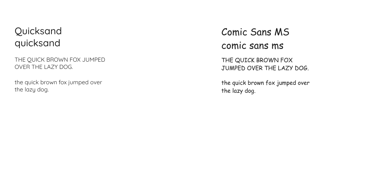
I chose to incorporate two fonts in my design. The first font was Quicksand because it is a san-serif font which makes content easier to read. The second font I selected was Comic Sans MS. I decided to use this font because it is a san-serif, and the overall styling of the letters convey a sense of adventure.
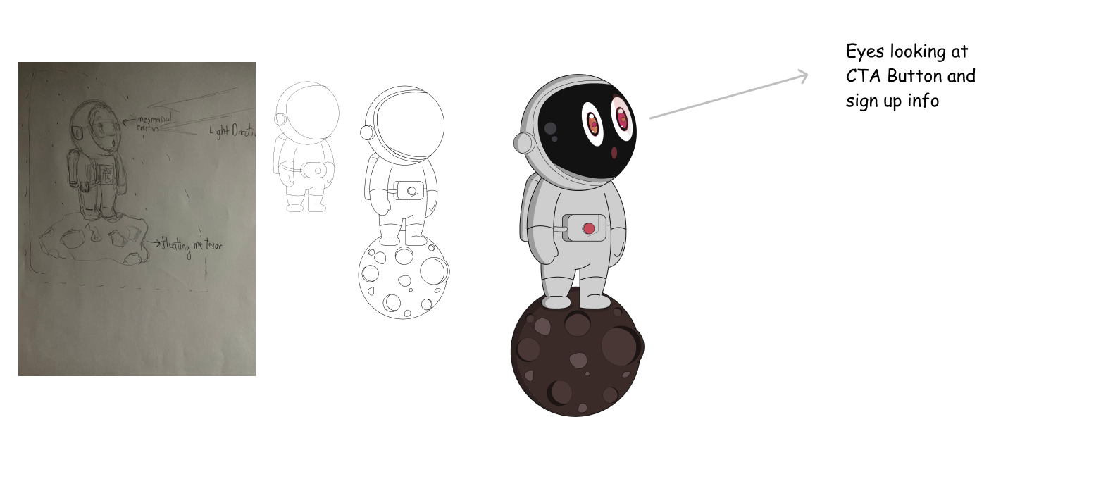
I wanted to incorporate a vector drawing that would direct the users attention to the written content on the modal.
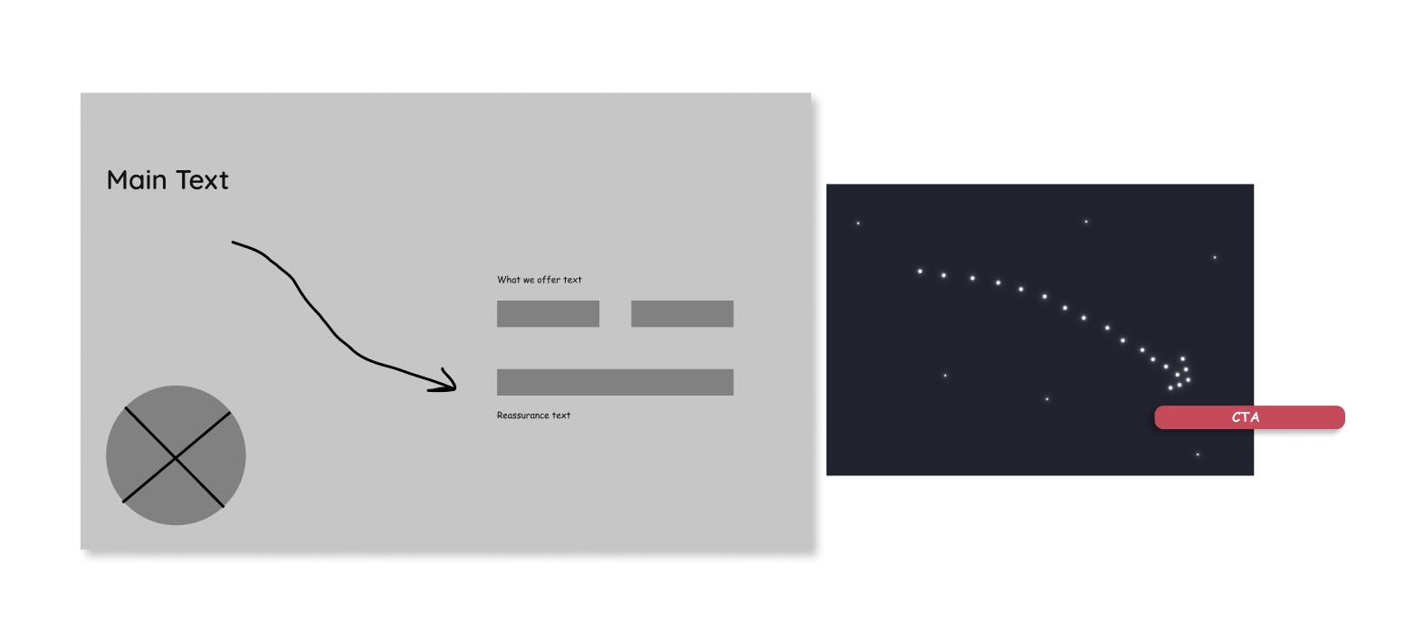
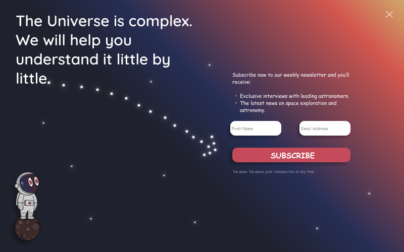
I started to create a wireframe to visualize how I wanted to layout the information. I decided to implement Gestalt Principles (common fate, similarity, continuity and proximity) by designing an arrow to symbolize a constellation that would point users to the call-to-action sign up button.
This is the first iteration of the newsletter modal.
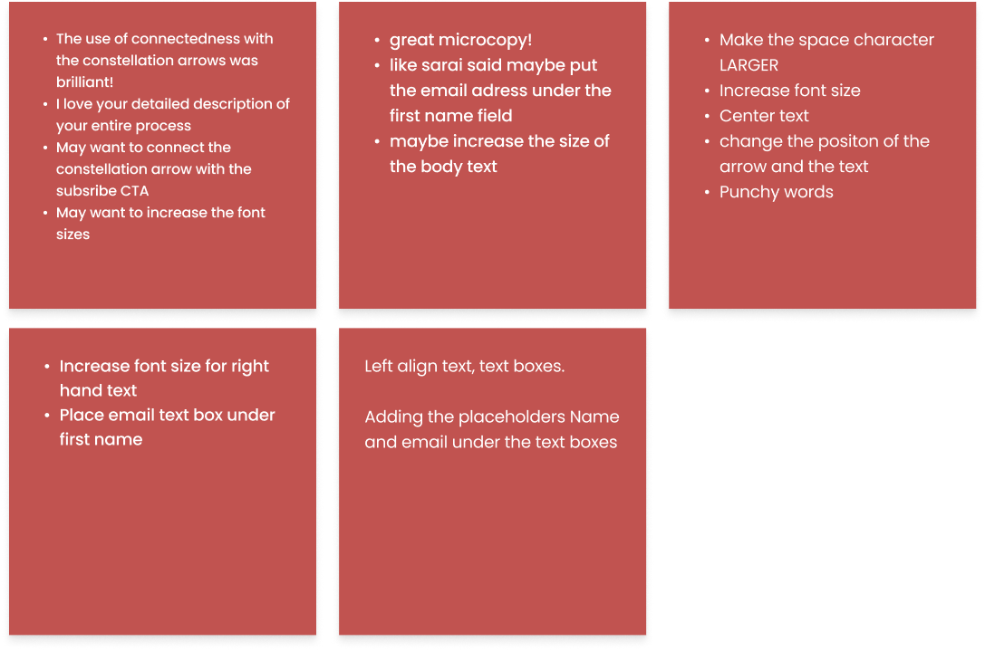
The key takeaways from the feedback I received were to: