Research
| Qualitative Research
People have difficulty finding beauty products unique to their needs.
With our research we wanted to learn three key details:
Determine interest in Augmented and Virtual Reality beauty shopping experiences.
Understand user pain points.
Understand positive user experiences.
| Research Method
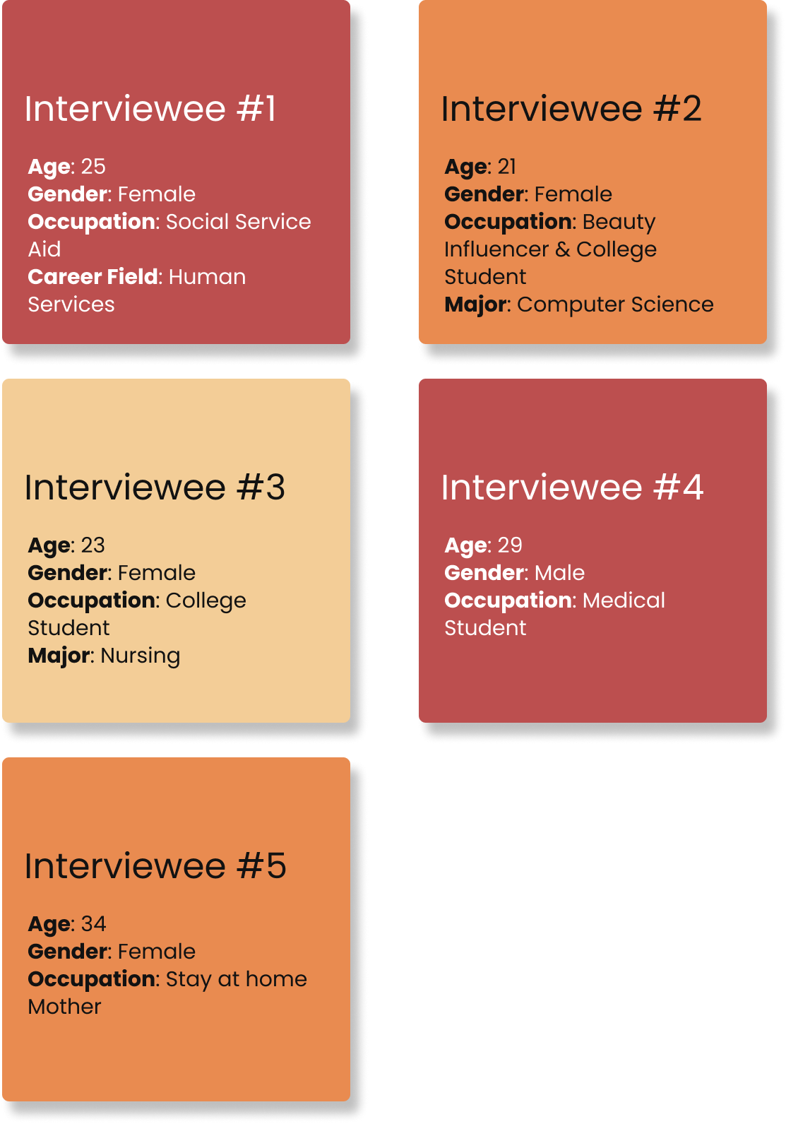
We conducted in-depth individual interviews with 5 participants.
Each interview was held in a remote setting.There was one interviewer and one note taker present with each interviewee.
We recorded each interview after we were given verbal consent by the participant.
Participants

| Qualitative Results
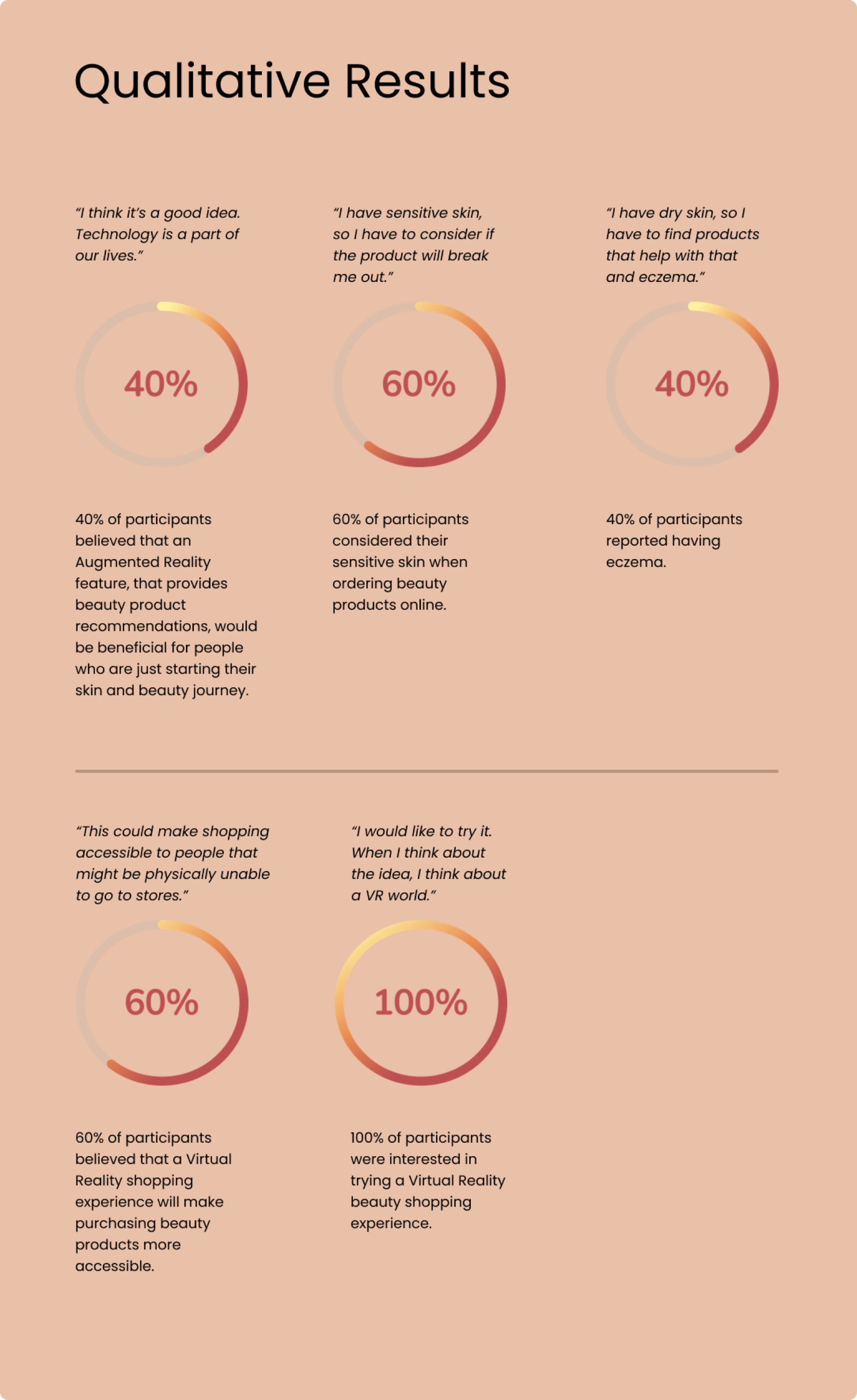
Two key takeaways from our qualitative research were:
100% of participants were interested in trying a Virtual Reality beauty shopping experience.
Omnis should implement an Augmented Reality feature that analyzes user's skin and offers them product recommendations.

| Quantitative Research
To start our quantitative research process, we began thinking about our hypothesis and null hypothesis.
| Hypothesis
People who purchase beauty products are interested in a Virtual Reality beauty product shopping experience.
| Null Hypothesis
People who purchase beauty products are not interested in a Virtual Reality beauty product shopping experience.
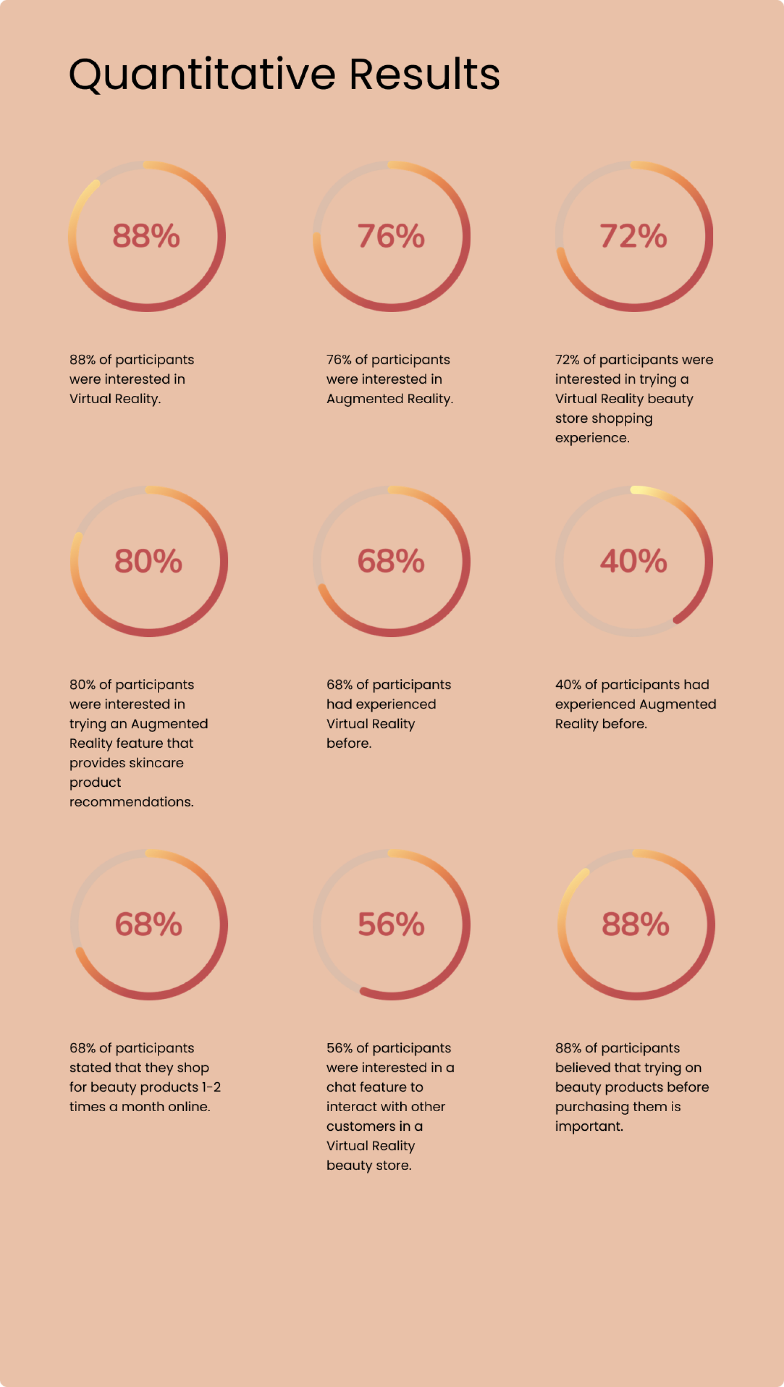
| Quantitative Results
There were a total of 69 survey responses. 25 participants passed the screener. The following results reflect their responses.

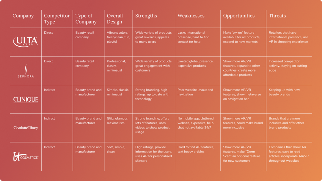
| Competitve Analysis
From our competitor analysis we uncovered that users have a hard time finding our competitor's AR and VR services.
Our 5 competitors were:
Ulta Beauty (Direct)
Sephora (Direct)
Clinique (Indirect)
Charlotte Tilbury (Indirect)
IT Cosmetics (Indirect)
| SWOT Analysis

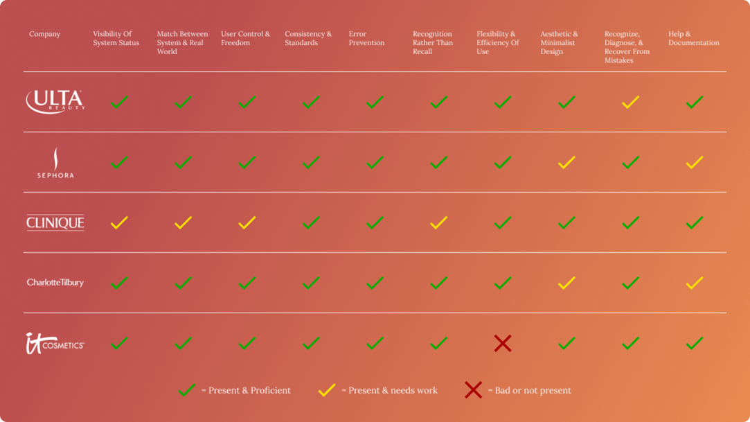
| Heuristic Evaluation

| Conclusion of Research
We found out that there was an interest in Omnis' Virtual Reality beauty store shopping experience. As well as an interest in Omnis' Augmented Reality services. The data we collected helped us to create a user persona to build the ideal service.
Priya's Story
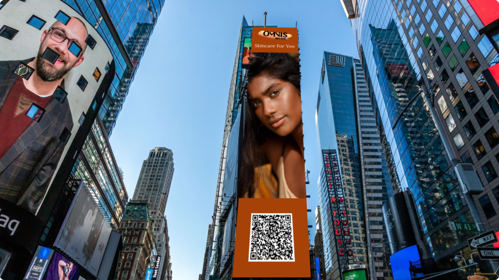
To begin the creation of our user persona we decided to make an advertisement for Omnis that would be displayed in Times Square. Our user, Priya, would see this advertisement and it would pique her interest.

| Persona
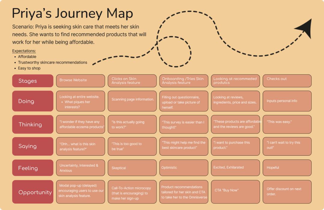
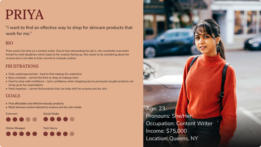
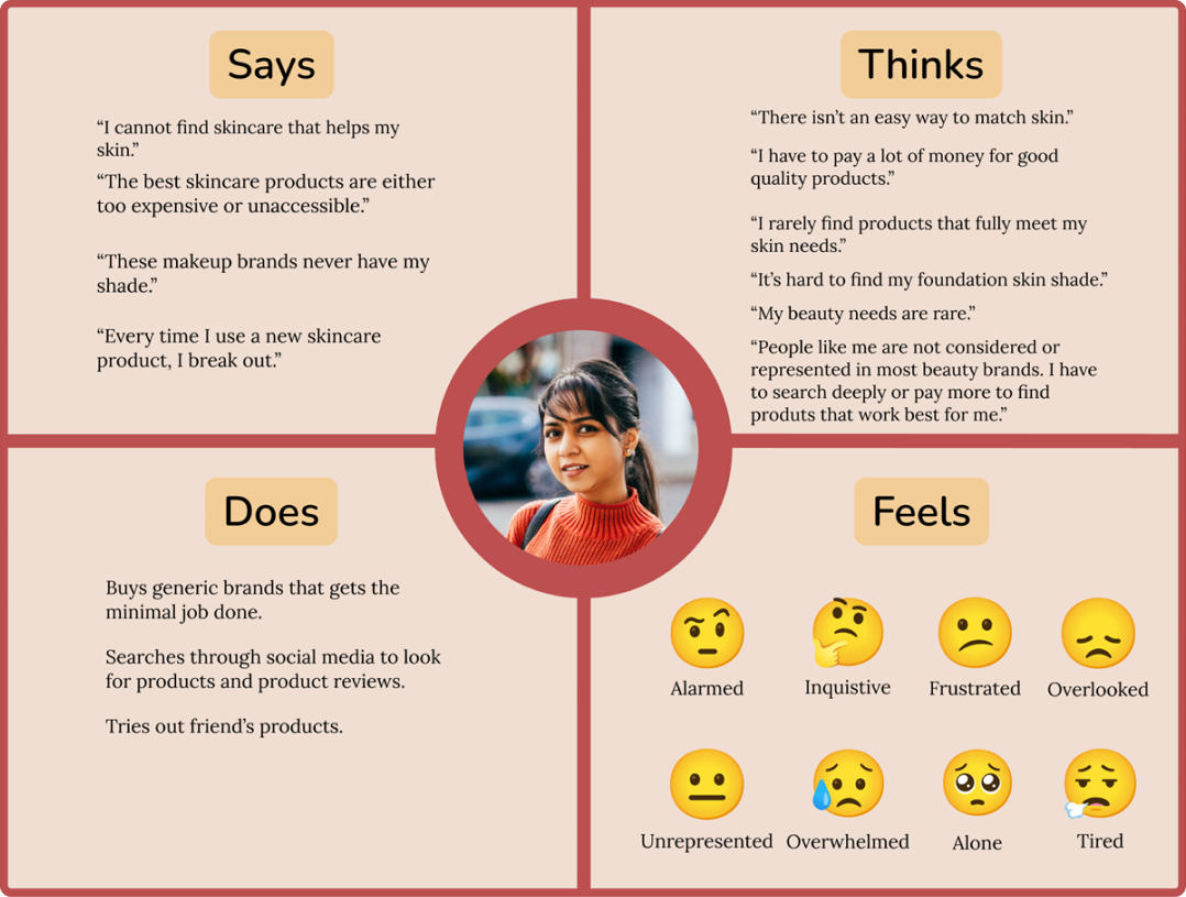
Priya's main desire is to find skincare products that work for her. One of her biggest frustrations is buying products that don't meet her expectations.

| Empathy Map

| Journey Map
